Building on top of matplotlib#
Read in Datasets#
WAS 2020 Data
Subset of an AVIRIS image
import pandas as pd
import rasterio
# Import example WAS data
was_2020_filepath = "./data/SARP 2020 final.xlsx"
was_2020 = pd.read_excel(was_2020_filepath, "INPUT", skipfooter=7)
# Import example AVIRIS data
with rasterio.open('./data/subset_f180628t01p00r02_corr_v1k1_img') as src:
    metadata = src.meta
    bands = src.read()
Accessing the matplotlib in pandas#
pandas’ plotting tutorial. Useful for reference or for skimming to see more of what the library can do.
# Processing the dataframe
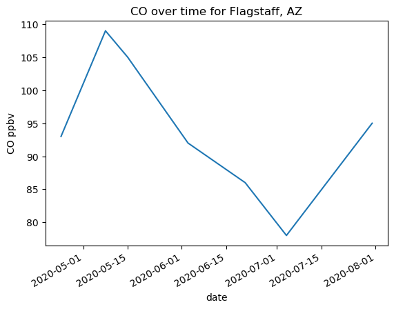
flagstaff_co = was_2020[was_2020['Location'] == 'Mars Hill/Lowell Observatory, Flagstaff, Arizona'][['Date', 'CO (ppbv)', 'CH4 (ppmv height)']]
flagstaff_co = flagstaff_co.set_index('Date')
# Making the plot
# !! Notice that DATAFRAME.plot() returns an axes object !!
ax = flagstaff_co['CO (ppbv)'].plot(xlabel='date', ylabel='CO ppbv')
ax.set_title('CO over time for Flagstaff, AZ')
Text(0.5, 1.0, 'CO over time for Flagstaff, AZ')
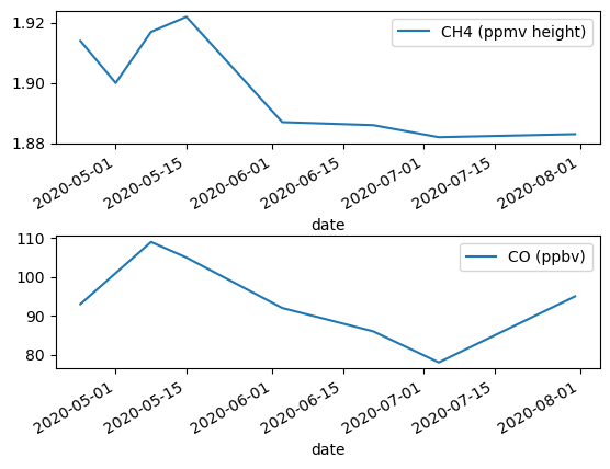
import matplotlib.pyplot as plt
# We can set our pandas dataframe inside a subplot created with matplotlib
fig, (ax1, ax2) = plt.subplots(2, 1)
flagstaff_co.plot(y='CH4 (ppmv height)', ax=ax1, xlabel='date')
flagstaff_co.plot(y='CO (ppbv)', ax=ax2, xlabel='date')
fig.subplots_adjust(hspace=0.7)  # Add more space between plots for labels
Scatter plot example#
import numpy as np
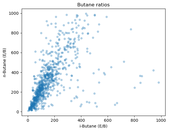
# Prepare the data
was_2020[(was_2020['n-Butane (E/B)'] < 0) | (was_2020['n-Butane (E/B)'] > 1000)]  = np.NaN
was_2020[(was_2020['i-Butane (E/B)'] < 0) | (was_2020['i-Butane (E/B)'] > 1000)]  = np.NaN
alpha sets the opacity of the points, meaning that it dictates how much you can see through them. I like using it on scatter plots becuase it helps see better the density of points when they are overlapping.
was_2020.plot.scatter(x='i-Butane (E/B)', y='n-Butane (E/B)', alpha=0.3)
plt.title('Butane ratios')
Text(0.5, 1.0, 'Butane ratios')
was_2020.plot()
<Axes: >
seaborn#
Trading control for ease#
matplotlib really lets you do most anything you can imagine to plots. While the control is nice you don’t always need it. If instead you are interested in making plots faster, you might use the library seaborn.
Note: seaborn is most useful if you are using data in a pandas dataframe. Creating plots from seaborn for numpy matrices is totally fine, but you don’t get the same level of benefit as you do with column labelled pandas data.
Installation#
conda install -c conda-forge -n lessons seaborn --yes
Feature: known for built in statistics support
Links#
Nice tutorial section, seperated by need: https://seaborn.pydata.org/tutorial.html
Example gallery also great for inspiration: https://seaborn.pydata.org/examples/index.html
A list of plot types based on data: https://seaborn.pydata.org/api.html#api-reference
import seaborn as sns
sns.set_theme()
Example with a pandas dataframe#
relplotdocs page
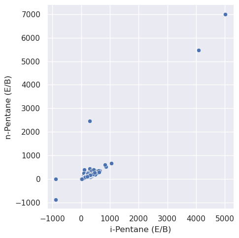
# Organizing the dataframe
was_2020_subset = was_2020[(was_2020['Weather'] == 'Cloudy') | (was_2020['Weather'] == 'clear')]
# Plotting with axis labels in one line
sns.relplot(data=was_2020_subset, x='i-Pentane (E/B)', y='n-Pentane (E/B)')
<seaborn.axisgrid.FacetGrid at 0x7effb2a11c90>
# A line plot version
sns.relplot(data=was_2020_subset, x='i-Pentane (E/B)', y='n-Pentane (E/B)', kind='line')
---------------------------------------------------------------------------
OptionError                               Traceback (most recent call last)
Cell In[16], line 2
      1 # A line plot version
----> 2 sns.relplot(data=was_2020_subset, x='i-Pentane (E/B)', y='n-Pentane (E/B)', kind='line')

File /srv/conda/envs/notebook/lib/python3.11/site-packages/seaborn/relational.py:955, in relplot(data, x, y, hue, size, style, units, row, col, col_wrap, row_order, col_order, palette, hue_order, hue_norm, sizes, size_order, size_norm, markers, dashes, style_order, legend, kind, height, aspect, facet_kws, **kwargs)
    946 g = FacetGrid(
    947     data=full_data.dropna(axis=1, how="all"),
    948     **grid_kws,
   (...)
    951     **facet_kws
    952 )
    954 # Draw the plot
--> 955 g.map_dataframe(func, **plot_kws)
    957 # Label the axes, using the original variables
    958 g.set(xlabel=variables.get("x"), ylabel=variables.get("y"))

File /srv/conda/envs/notebook/lib/python3.11/site-packages/seaborn/axisgrid.py:819, in FacetGrid.map_dataframe(self, func, *args, **kwargs)
    816     kwargs["data"] = data_ijk
    818     # Draw the plot
--> 819     self._facet_plot(func, ax, args, kwargs)
    821 # For axis labels, prefer to use positional args for backcompat
    822 # but also extract the x/y kwargs and use if no corresponding arg
    823 axis_labels = [kwargs.get("x", None), kwargs.get("y", None)]

File /srv/conda/envs/notebook/lib/python3.11/site-packages/seaborn/axisgrid.py:848, in FacetGrid._facet_plot(self, func, ax, plot_args, plot_kwargs)
    846     plot_args = []
    847     plot_kwargs["ax"] = ax
--> 848 func(*plot_args, **plot_kwargs)
    850 # Sort out the supporting information
    851 self._update_legend_data(ax)

File /srv/conda/envs/notebook/lib/python3.11/site-packages/seaborn/relational.py:645, in lineplot(data, x, y, hue, size, style, units, palette, hue_order, hue_norm, sizes, size_order, size_norm, dashes, markers, style_order, estimator, errorbar, n_boot, seed, orient, sort, err_style, err_kws, legend, ci, ax, **kwargs)
    642 color = kwargs.pop("color", kwargs.pop("c", None))
    643 kwargs["color"] = _default_color(ax.plot, hue, color, kwargs)
--> 645 p.plot(ax, kwargs)
    646 return ax

File /srv/conda/envs/notebook/lib/python3.11/site-packages/seaborn/relational.py:423, in _LinePlotter.plot(self, ax, kws)
    415 # TODO How to handle NA? We don't want NA to propagate through to the
    416 # estimate/CI when some values are present, but we would also like
    417 # matplotlib to show "gaps" in the line when all values are missing.
   (...)
    420
    421 # Loop over the semantic subsets and add to the plot
    422 grouping_vars = "hue", "size", "style"
--> 423 for sub_vars, sub_data in self.iter_data(grouping_vars, from_comp_data=True):
    425     if self.sort:
    426         sort_vars = ["units", orient, other]

File /srv/conda/envs/notebook/lib/python3.11/site-packages/seaborn/_oldcore.py:1028, in VectorPlotter.iter_data(self, grouping_vars, reverse, from_comp_data, by_facet, allow_empty, dropna)
   1023 grouping_vars = [
   1024     var for var in grouping_vars if var in self.variables
   1025 ]
   1027 if from_comp_data:
-> 1028     data = self.comp_data
   1029 else:
   1030     data = self.plot_data

File /srv/conda/envs/notebook/lib/python3.11/site-packages/seaborn/_oldcore.py:1119, in VectorPlotter.comp_data(self)
   1117 grouped = self.plot_data[var].groupby(self.converters[var], sort=False)
   1118 for converter, orig in grouped:
-> 1119     with pd.option_context('mode.use_inf_as_null', True):
   1120         orig = orig.dropna()
   1121         if var in self.var_levels:
   1122             # TODO this should happen in some centralized location
   1123             # it is similar to GH2419, but more complicated because
   1124             # supporting `order` in categorical plots is tricky

File /srv/conda/envs/notebook/lib/python3.11/site-packages/pandas/_config/config.py:480, in option_context.__enter__(self)
    479 def __enter__(self) -> None:
--> 480     self.undo = [(pat, _get_option(pat)) for pat, val in self.ops]
    482     for pat, val in self.ops:
    483         _set_option(pat, val, silent=True)

File /srv/conda/envs/notebook/lib/python3.11/site-packages/pandas/_config/config.py:480, in <listcomp>(.0)
    479 def __enter__(self) -> None:
--> 480     self.undo = [(pat, _get_option(pat)) for pat, val in self.ops]
    482     for pat, val in self.ops:
    483         _set_option(pat, val, silent=True)

File /srv/conda/envs/notebook/lib/python3.11/site-packages/pandas/_config/config.py:146, in _get_option(pat, silent)
    145 def _get_option(pat: str, silent: bool = False) -> Any:
--> 146     key = _get_single_key(pat, silent)
    148     # walk the nested dict
    149     root, k = _get_root(key)

File /srv/conda/envs/notebook/lib/python3.11/site-packages/pandas/_config/config.py:132, in _get_single_key(pat, silent)
    130     if not silent:
    131         _warn_if_deprecated(pat)
--> 132     raise OptionError(f"No such keys(s): {repr(pat)}")
    133 if len(keys) > 1:
    134     raise OptionError("Pattern matched multiple keys")

OptionError: No such keys(s): 'mode.use_inf_as_null'
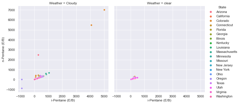
# Adding colors, sizes, and comparison graphs based on additional columns of the dataframe
sns.relplot(data=was_2020_subset, x='i-Pentane (E/B)', y='n-Pentane (E/B)', hue='State',
           col='Weather')
<seaborn.axisgrid.FacetGrid at 0x21c703f29a0>
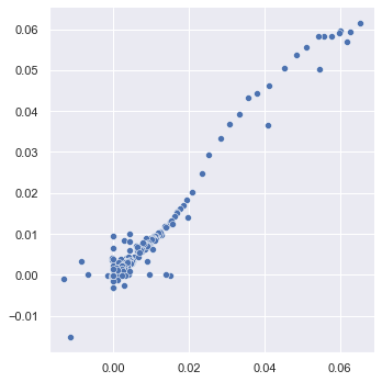
Example with numpy arrays#
You can use seaborn with matrix data but in the case of numpy arrays you don’t get quite as much benefit. The colors and styles are nice but you don’t get the axis lables with just a matrix of data.
relplotdocs page
band_100_135 = bands[:, 100, 135]
band_200_330 = bands[:, 200, 330]
sns.relplot(x=band_100_135, y=band_200_330)
<seaborn.axisgrid.FacetGrid at 0x21c7038bb20>
Customizing#
Because seaborn is built on top of matplotlib, you can still choose to customize the plots with the same commands as matplotlib.
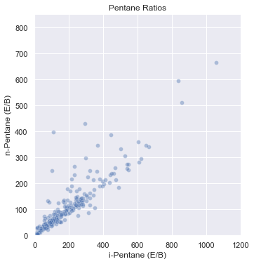
sns.relplot(data=was_2020_subset, x='i-Pentane (E/B)', y='n-Pentane (E/B)', alpha=0.4)
plt.title('Pentane Ratios')
plt.xlim(0, 1200) # change the x axis range
plt.ylim(0,850)  # change the y axis range
(0.0, 850.0)